Pops of Color Enhancing Design
With Valentine’s Day just around the corner, color often enters the mind in the form of reds, pinks, and purples. So, what better way to usher in Valentine’s Day this year than with a blog post dedicated to those cupid-centric pops of colors. Not to mention the use of color within interior design, in general.
Over the years, Kasia Karska Design – a Vail interior designer, as well as a design-build firm – has often used pops of color to enhance our interior design. Color speaks differently to each individual. Therefore, just like interior design itself, the use of color is very client-specific. But, we’ve found most clients enjoy some pops of color within their home. Below is a showcase of various times that pops of color have been used within our interior design at KKD. Some of the samples you’ll see use reds and purples – we are showcasing these samples in honor of Valentine’s Day. And the other sample will contain a color that has nothing to do with Valentine’s Day, but is nonetheless aesthetically pleasing.
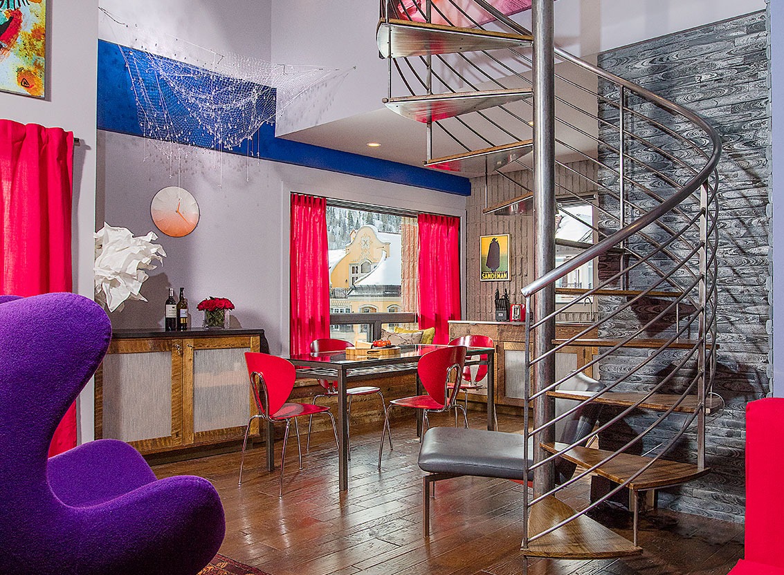
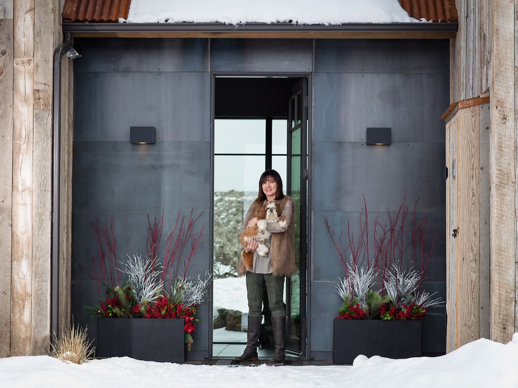
In the below two images, you’ll see vibrant reds being used to add some intrigue to a kitchen design by Kasia Karska Design. And you’ll also see a more subtle use of red to greet guests on the outside of a home.

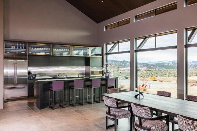
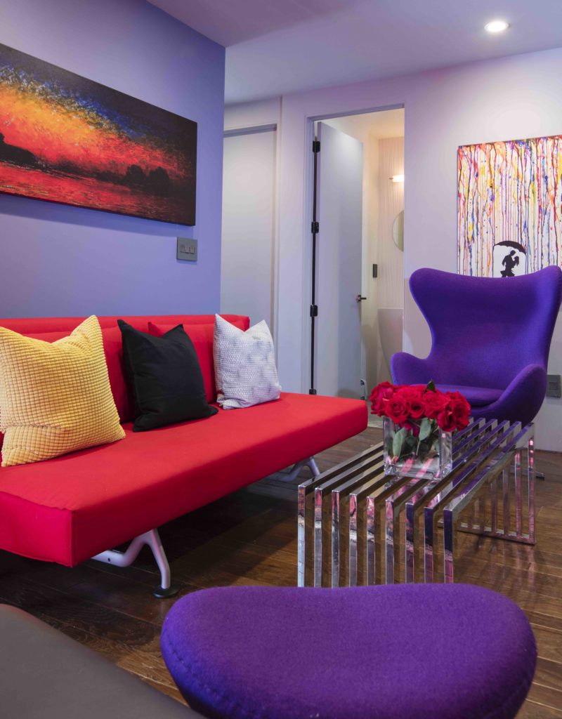
In the next two images you’ll see the use of purple to add some pops of color into the homes. Notice, there’s a very distinct difference in the use and vibrancy of the color employed, that varies from the first home to the second home. Both use a shade of the color purple, but in decidedly different ways.
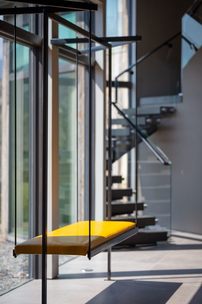
And lastly, note the below image and how vibrant yellow is used to draw the viewer in to the custom-made suspended steel bench, as well as draw the eye to the vast picture window behind it.
As you can see, the use of color is a key element employed when designing a space. And pops of color can turn up in any kind of design – from mountain to modern and traditional to whimsical. With that in mind, we wish you a very Happy Valentine’s Day! Go enjoy those cupid colors!
* If you’d like to talk to us about an upcoming project of your own or anything else you have in mind, please reach out. We’re always here to help! And, you can go to our “About Us” page for more info about Kasia Karska Design.
Beautiful photography by: Brent Bingham Photography